.svg?w=300&h=85)
When people shop for new bedding, they often start with thread count, craftsmanship, and price. But once they actually sleep in it, they realize that what really shapes the mood of a bedroom is often the color. After work, you open the door, switch on the light, and that broad wash of color across the bed is the first thing that greets you. Whether your mood starts to settle, whether your body feels ready to let go, the answer often appears within those first few seconds.
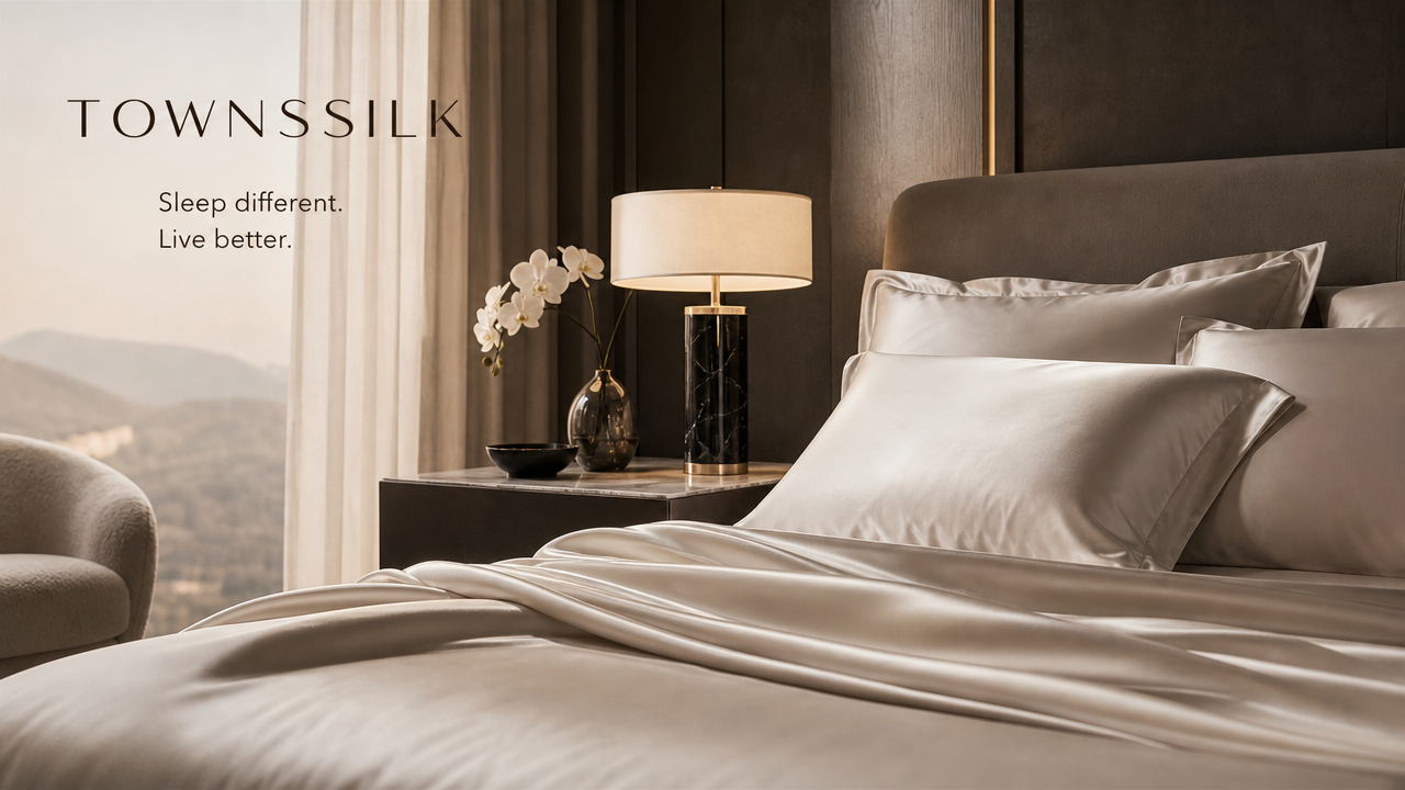
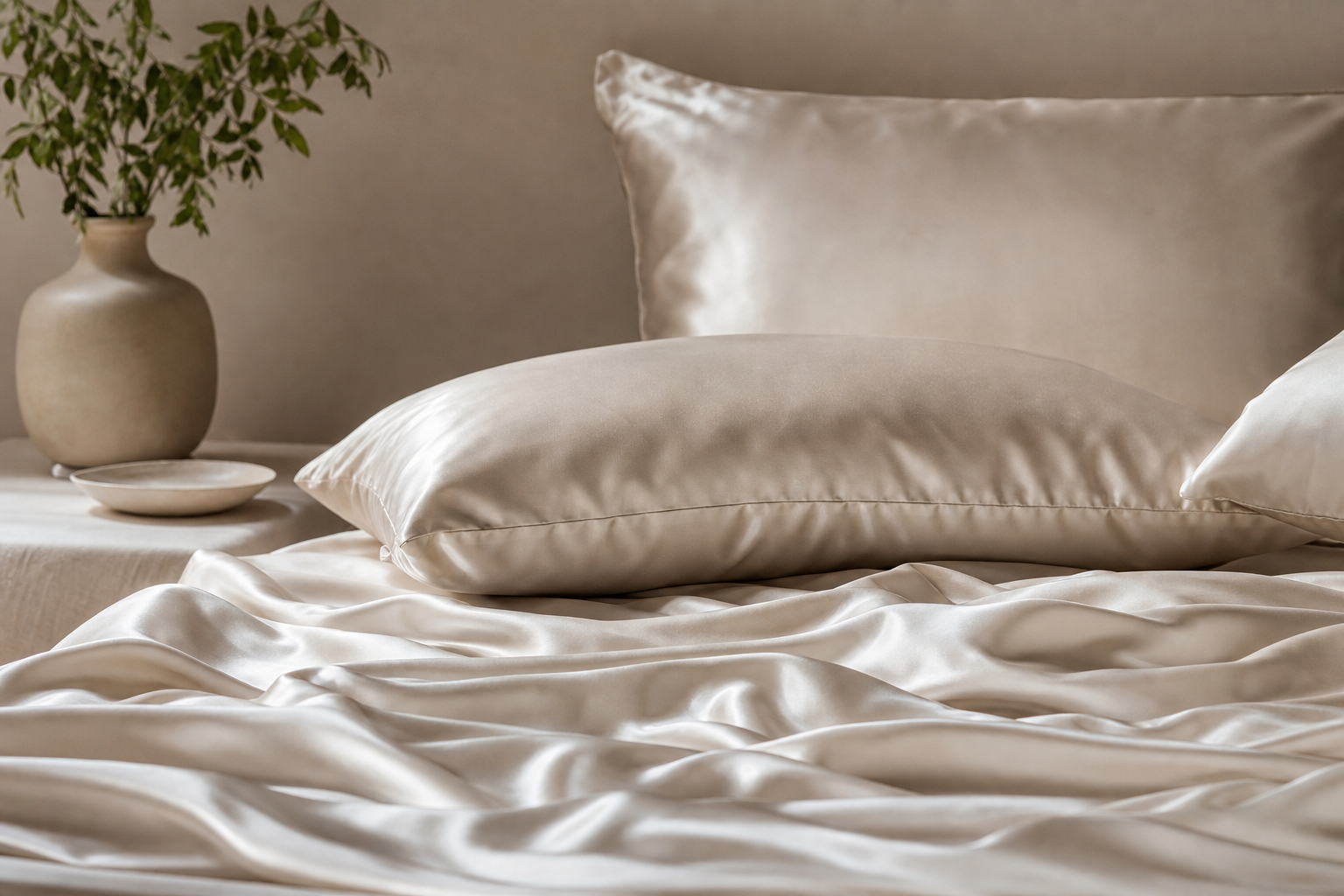
A silk sheet set is memorable not only because it feels smooth and soft, but also because it “holds” color so beautifully. When gentle light falls across the fabric, dusty blue does not turn dull, and blush rose never feels overly sweet. It is as if a soft pearly glow lifts every shade, giving the bedroom a more refined emotional atmosphere at once.
Why Silk Amplifies the Mood of Color
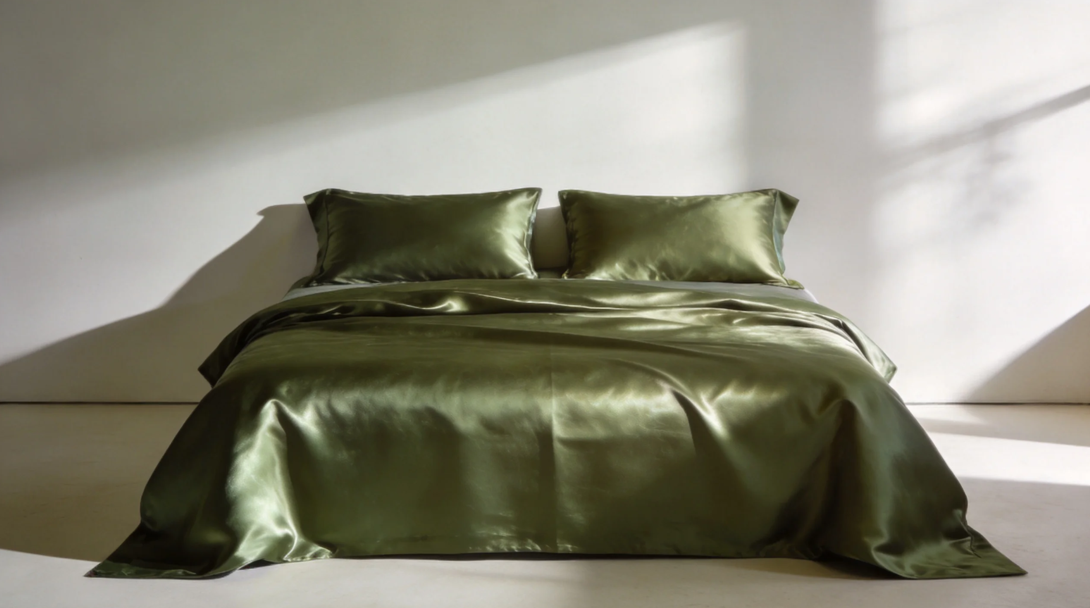
The same blue fabric can feel completely different in cotton than it does in silk. Silk does not reflect light with a harsh shine; instead, the glow moves softly with every fold. That gives low-saturation colors more depth—quiet up close, yet never flat from a distance. This soft, glazed effect, almost like layers in an oil painting, is exactly why so many people fall for it at first sight.
Products like TOWNSSILK, which place real emphasis on color expression, often approach designer-collab shades with restraint. Instead of relying on high-impact color, they let each tone reveal a different side in morning light, under wall lamps, and in the evening. Bedding is no longer just something that looks neatly made—it becomes the emotional backdrop of the bedroom.
Bedroom Color Palettes That Tend to Stay With You
Calming tones for anyone craving a slower pace
Dusty blue, grayish lavender, and olive green all work well for people with fast-moving routines. They do not weigh the room down or make it feel dark; instead, they bring a sense of steadiness. Paired with silk’s delicate sheen, the bed can look like gently rippling water. The moment you step into the bedroom, the visual noise drops, and your breathing often slows with it.
Gentle tones for anyone who needs comfort
Blush rose, creamy apricot, and light tea shades feel closer to everyday ease. They are not overly girlish, and they never become too sugary. They also pair naturally with wood furniture or off-white walls. This kind of softness is not limp or sleepy—it simply makes you more willing to put down the fatigue of the day.
- Low-saturation colors stay appealing longer than highly intense shades
- Tones with a muted, gray cast suit bedrooms better over time
- Silk’s sheen gives lighter colors more visual depth
- The value of designer-collab colors lies in thoughtful palette choices, not hype
When choosing a sheet set, do not just ask which one looks more luxurious. Ask whether it works with your routine, your lighting, and your walls. If it helps you relax even a little at first glance, that is the kind of color you will want to live with for years.
Turning Emotional Comfort Into Details You Feel Every Day
A bedroom is not a showroom, and color is not just a prop for photos. Truly good bedding brings touch, warmth, and visuals into one experience the moment you slip under the covers after a shower.
Some colors are quiet, yet they make the night feel better.When silk’s pearly glow meets a restrained color palette, the bed becomes more than just a place to sleep—it turns into a small space where you can recover and reset. Choosing the right color set often changes not the room itself, but the way it feels to come home.